Akamai Media LLC Web Performance Report

A clear look at
Selson Capital's website.

A plain-English review of how selsoncapital.com is working today: what a prospective client sees, how much of the site search engines can actually reach, and where a few focused changes would make the biggest difference.

Prepared for
Selson Capital
Website
selsoncapital.com
Site captured
August 24, 2026
Prepared by
Mark Moran
0/100
Opportunity

Overall website health

The site looks the part. The typography is consistent, the photography is strong, and the monochrome palette holds together across every page. Underneath that surface, though, most of the site is invisible: 13 of your 23 pages are not linked from the navigation, including all three service detail pages and every team bio. The homepage carries 156 words, and the structured data tells an AI assistant your site's name and nothing else about what you do. None of this is a rebuild from zero. It is a well-designed site whose content and structure have not caught up with it.

Strong Opportunity Needs attention

Your site at a glance

Your sitemap lists 23 pages. Your navigation reaches 7 of them. That gap is the single biggest structural finding in this report, and it is also the easiest one to close.

23Pages in your sitemapsubmitted to Google
13Not linked from the sitereachable only by direct URL
2Levels deepa healthy, shallow structure
4 of 8Expected page types present
How your pages are organized
Home1
About Us1
Services1
Service detail pages3
Team bios7
Become a Client1
Be Our Supplier1
Careers1
Book Online1
Strategic Planning Session1
Pricing Plans1
Payment Request1
Introductory Consultation1
Leftover duplicate pages2
Content a visitor expects to find
Services
About
Pricing
Booking
Contact page
Blog or insights
Testimonials or case studies
FAQ
  • Shallow and clean. Nothing on the site is more than two clicks from the homepage, and your XML sitemap is in place and referenced from robots.txt. That is the part most sites get wrong, and yours is right.
  • Your best content is unreachable. The three service detail pages and the whole team section, seven pages of named people with bios, are not linked from the navigation or from the Services and About pages. I checked those pages directly. A visitor can only land on them from a search result.
  • Two Services pages are competing. /copy-of-exclusive-services is live, indexable, and in your sitemap, with the same page title and the same "What We Do" heading as the real Services page. It also carries a spelling error, "Social Media Manegment", that the live page does not.
  • No contact page. Contact is a section at the bottom of the homepage with an email address on it. There is no contact page for Google to rank and no form or phone number anywhere on the homepage.

Read from your XML sitemap index on August 24, 2026, then link-checked by loading the homepage, Services, About and Team pages and reading their actual links. Two pages the sitemap scan first flagged as unreachable, Book Online and Strategic Planning Session, turned out to be linked from the Services page, so they are not counted in the 13.

Your nine-point scorecard

Every Akamai web performance report looks at the same nine areas: the things that decide whether a website earns trust, gets found, and turns visitors into clients. Each area is scored out of 100, and together they average to the overall score above. Click any card to read the full explanation of that area.

This is the strongest area of the site and it is not close. The serif logotype, the restrained monochrome palette, and the quality of the photography all read as a studio that knows what it is doing. What is missing is not polish, it is evidence.

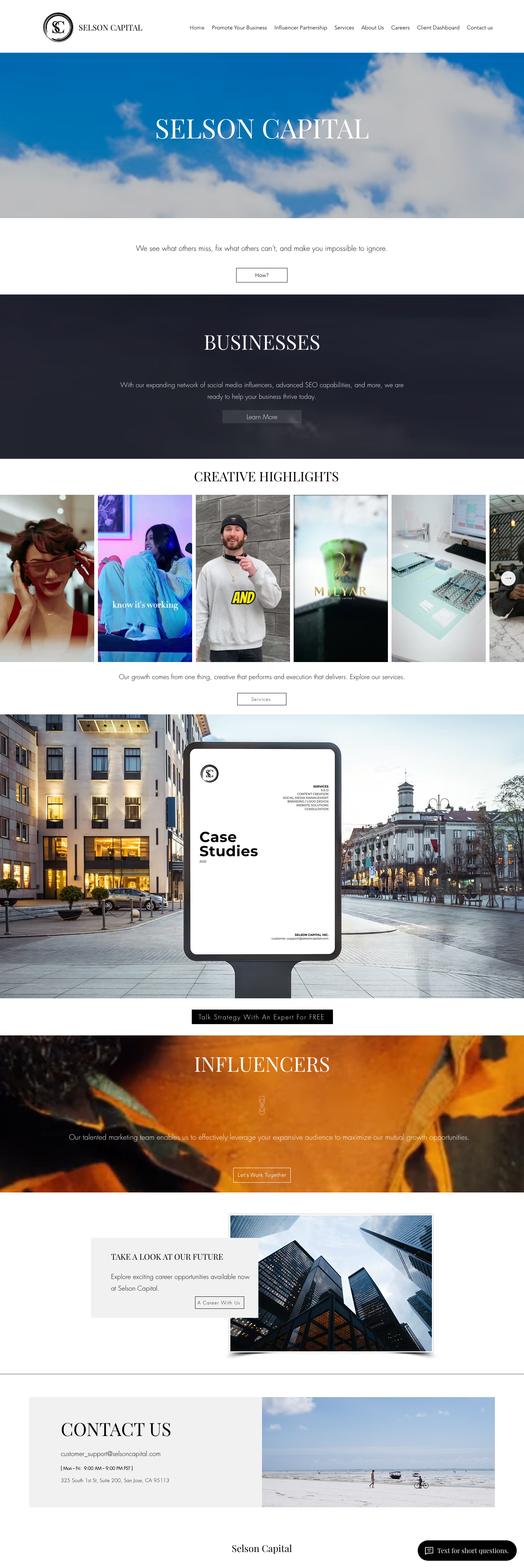
Selson Capital homepage as it appears today, showing the logotype, a full-width sky photograph behind the company name, and the Creative Highlights gallery below
selsoncapital.com homepage, captured August 24, 2026.
What a prospective client meets
Consistent, confident type across every page, with real restraint in the palette
1
The hero says the company name and nothing else. Your actual positioning line sits below it, on white, where a scrolling visitor may never stop
2
Low-contrast buttons. "Learn More" and "Let's Work Together" are pale text on translucent boxes over busy photographs, so they read as captions rather than as buttons
3
The Case Studies billboard is an image, not a link. It advertises case studies that do not exist anywhere on the site
4
The Creative Highlights gallery has no captions. Six pieces of work with no client, no brief, and no result attached to any of them
Working

The visual language is already yours

Most small agency sites are a template with the colors swapped. This one has a point of view: one typeface family used well, a deliberate black and white palette, and photography chosen rather than bought by the sheet. That is an asset worth building on rather than replacing.

Gap

The design shows the work but never proves it

The gallery, the billboard mockup, and the Influencers band all gesture at results without naming a single client, campaign, or number. A prospective client scrolls the whole homepage and leaves knowing what you look like and not what you have done.

Gap

Buttons that do not look clickable

Three of the site's calls to action sit as pale text over photographs with no solid fill and no border. The black "Talk Strategy With An Expert For FREE" button is the exception and it is the one that works. Matching the others to it is a styling change, not a redesign.

Why this matters for your clients

Design is the only part of a website that gets judged before a single word is read. Yours passes that test, which means the work left to do is about substance rather than looks, and that is a much better position to be starting from.

You have the plumbing: a sitemap index, a robots.txt that references it, canonical tags, and a meta description on the homepage. What Google does not have is much to read, or a way to reach most of your pages.

How much content Google has to work with
Your homepage
156 words
Your Services page
110 words
Agency pages that rank
~800 words
Measured from the rendered pages, not the source. Thin pages struggle to rank no matter how good the title is.
XML sitemap robots.txt points to it Canonical tags Meta description Page title length Descriptive H1 Internal linking Descriptive image alt text
Working

The technical foundation is done

Your sitemap index is live and referenced from robots.txt, every page carries a canonical tag, the homepage has a real meta description, and nothing sits more than two clicks deep. Plenty of sites I look at are missing all four.

Gap

Thirteen of your twenty-three pages are not linked from anywhere

Google discovers and weights pages largely through the links between them. Your three service detail pages, your Team page and its six bios, Pricing Plans, Payment Request, Introductory Consultation, and two leftover duplicates are all in the sitemap but reachable only by typing the URL. I confirmed this by loading the homepage, Services and About pages and reading their links. Adding these to the navigation and to the Services page is the highest-value change on this list.

Gap

A duplicate Services page is competing with the real one

/copy-of-exclusive-services is live, indexable, in your sitemap, and carries the identical page title "Services | Selson Capital" and the identical "What We Do" heading. Each page canonicals to itself, so neither defers to the other. It also still says "Social Media Manegment", which the current page does not. This one should be deleted, or set to noindex if you want to keep it.

Gap

The homepage title and H1 do not say what you do

The title runs 95 characters, so Google truncates it in results, and it is built as a keyword list separated by pipes. The H1 is "SELSON CAPITAL", your name rather than your offer. A title around 60 characters and an H1 naming the service and the market, Bay Area marketing agency, is a same-day change.

Gap

Thirty-two of your thirty-eight images carry no description

Every image on the homepage has an alt attribute, which is correct markup and why the accessibility scan passes. Thirty-two of them are empty, so they are declared decorative. On a page whose main proof of quality is a gallery of creative work, that is a lot of signal you are choosing not to send.

Why this matters for your clients

Search is where most agency enquiries start, and it is the service you sell. Right now Google is being shown a fraction of your site and asked to rank it on 156 words. Everything needed to fix that already exists on the site. It just needs to be connected and described.

When someone asks ChatGPT or Google's AI overview for a marketing agency in the Bay Area, the assistant reads structured data before it reads the page. Yours declares one thing: that a website exists.

What an AI assistant can actually tell a client about you
Can read today
  • That a website exists (schema.org WebSite)
  • The site name, Selson Capital
Can't find, so won't recommend
  • That you are an organization or an agency
  • Your San Jose address and service area
  • Your business hours
  • Your list of services
  • Your team
  • Any pricing, review, or FAQ detail
Working

Structured data is present

The site already outputs schema.org JSON-LD, so the mechanism is in place and switched on. That is a smaller step from here than starting with none.

Gap

Only the WebSite type is declared

WebSite tells an assistant a site exists at this address. It says nothing about who runs it, where they are, or what they sell. Adding Organization and LocalBusiness with your San Jose address and your Monday to Friday hours, plus a Service entry for each of your service pages, is a one-time addition.

Gap

The facts an assistant needs are on the page but not in the data

Your address, your hours, your team, and your services are all published somewhere on the site as ordinary text. None of it is marked up, so an assistant has to guess at it or skip you. This is the cheapest gap in the report to close because nothing new has to be written.

Why this matters for your clients

A growing share of buyers now ask an assistant for a shortlist instead of scrolling results, and the assistant answers from structured data first. Agencies that mark up their own details get named in those answers. Agencies that do not are simply not in the running.

The writing that is here is good. "We see what others miss, fix what others can't, and make you impossible to ignore" is a real line, not filler. There is just not very much of it, and the questions a buyer asks before hiring an agency are mostly unanswered.

Questions a prospective client looks for, answered on the site?
3 of 8covered
Who you are
Roughly what you offer
That there is a way to book time
What each service actually involves
Work you have done, with results
Who is on the team
What it costs, or how pricing works
What happens after you get in touch
Working

The voice is distinctive

The positioning line and the Businesses and Influencers sections are written with a point of view rather than assembled from stock phrases. That is the hard part of agency copy and it is already done.

Gap

Three of the four missing page types are the ones buyers look for

There is no case study or testimonial anywhere on the site, no blog or insights section, and no FAQ. For an agency selling content and SEO, the absence of your own published work is the gap a prospect notices first.

Gap

The detail you have written is hidden

Your three service detail pages and your six team bios already exist and are already written. They are just not linked. A large part of the content gap in this section closes the moment those pages are put into the navigation.

Gap

156 words on the homepage

The homepage carries 156 words and the Services page carries 110. Both work as a visual experience and neither gives a reader, or Google, enough to form a judgement on.

Why this matters for your clients

Buyers hiring an agency are trying to reduce risk, and they do it by reading. Every question the site leaves unanswered is one they have to ask on a call, or decide not to bother asking at all.
You have more conversion machinery than most agency sites: a booking page, a strategic planning session page, a pricing page, a members area, and a payment page. The problem is not that the path is missing. It is that most of it is not signposted.

The path from landing to booked, where it breaks
Step 1
Lands on the homepage
Step 2
Reads the positioning line
Step 3
Looks for proof, finds an uncaptioned gallery
Step 4
Looks for a way to contact you, finds an email address
Step 5
Books, if they reach the Services page
Working

Booking is already built

The Services page links to both Book Online and the Strategic Planning Session, and it carries a working form. "Talk Strategy With An Expert For FREE" on the homepage is a genuinely good offer, well placed and clearly styled.

Gap

No form and no phone number on the homepage

The homepage has zero forms and no telephone link. I checked the homepage, Services and About pages: there is no tel: link anywhere on any of them. The only route to you from the homepage is a mailto link on customer_support@selsoncapital.com, which is a support address rather than a sales one.

Gap

Contact is a section, not a page

"Contact us" in the navigation jumps to a block at the bottom of the homepage. That means there is no contact page for Google to rank, no page to send an ad or an email signature to, and no form at the moment a visitor is ready to act.

Gap

Pricing exists and is unreachable

A Pricing Plans page is live on the site and is not linked from the navigation, the homepage, or the Services page. Pricing is one of the two or three things a buyer looks hardest for.

Why this matters for your clients

Every one of these is a routing problem rather than a build problem. The pages you need people to reach already exist, which means most of this section is fixed by adding links and one form rather than by building anything new.

The signals that are hardest to fake are all here: a physical San Jose address, published business hours, a secure connection, and six named people with written bios. The signals a buyer scans for in the first ten seconds are the ones missing.

Trust signals a prospective client scans for
Secure connection
Real street address
Published business hours
No reviews or testimonials
No named client work
Working

A real business, plainly stated

325 South 1st St, Suite 200, San Jose, plus Monday to Friday, 9:00 AM to 9:00 PM PST, published on the homepage. Many agency sites deliberately blur this. Yours does not, and that reads well.

Working

Six team bios already written

The Team page and its six individual bios are live and complete. Naming the people who will do the work is one of the strongest trust signals an agency has, and the writing is already done.

Gap

That team is invisible

The Team page is not linked from the navigation, from the About page, or from the homepage. The single best credibility asset on the site can only be found by typing the URL.

Gap

No testimonial, review, or named client anywhere

The site shows creative work and mentions results without attaching a client name, a quote, or a number to any of it. A billboard mockup that says "Case Studies" with no case studies behind it draws attention to the absence rather than covering it.

Gap

No phone number

A support email address is the only contact route on the homepage. For a service business at this price point, a visible phone number is a trust signal in its own right, whether or not anyone rings it.

Why this matters for your clients

Choosing an agency is a high-risk purchase made largely on evidence of past work. You have the harder trust signals already. What is missing is the proof, and some of it is a page-link away.

I ran an automated WCAG scan across the homepage using axe-core, the same engine most auditing tools are built on. It evaluated 43 rules and found no violations. That is an uncommon result and it deserves to be said first.

Automated accessibility scan, 0 violations across 43 rules
0 issues found
AAAAAA
Web accessibility grade
"AA" is the accessibility grade the law effectively expects a business website to meet, and nothing in the automated scan puts you below it. Three checks came back as "needs human review" rather than pass or fail, all of them color contrast over photographs. That matches what I saw by eye on the "Learn More" and "Let's Work Together" buttons. Automated scans also cannot judge keyboard order or screen-reader wording, so this is a strong result rather than a clean bill of health.
Working

Every image carries an alt attribute

All 38 images on the homepage have an alt attribute present. Thirty-two are intentionally empty, which is the correct markup for a decorative image and is exactly why the scan passes. Six carry real descriptions.

Working

The structural basics are right

The page declares its language, has a single H1, uses a sensible heading order beneath it, and sets a proper viewport. These are the things that most often fail an audit and none of them does here.

Gap

Three contrast checks need a human eye

Pale text sitting over photographs cannot be scored automatically, so axe returns "incomplete" rather than a pass. The two pale buttons flagged in the Design section are the same elements. Giving them a solid fill fixes the readability problem and the contrast question together.

Why this matters for your clients

Accessibility is where a lot of otherwise good sites quietly fail, and it is increasingly where demand letters start. Yours is in genuinely good shape, and the only open item is the same styling fix that would improve the design anyway.

The phone layout is the stronger of the two. Type is large, the sections stack cleanly, the background photography fills the full band, and nothing scrolls sideways.

On a phone
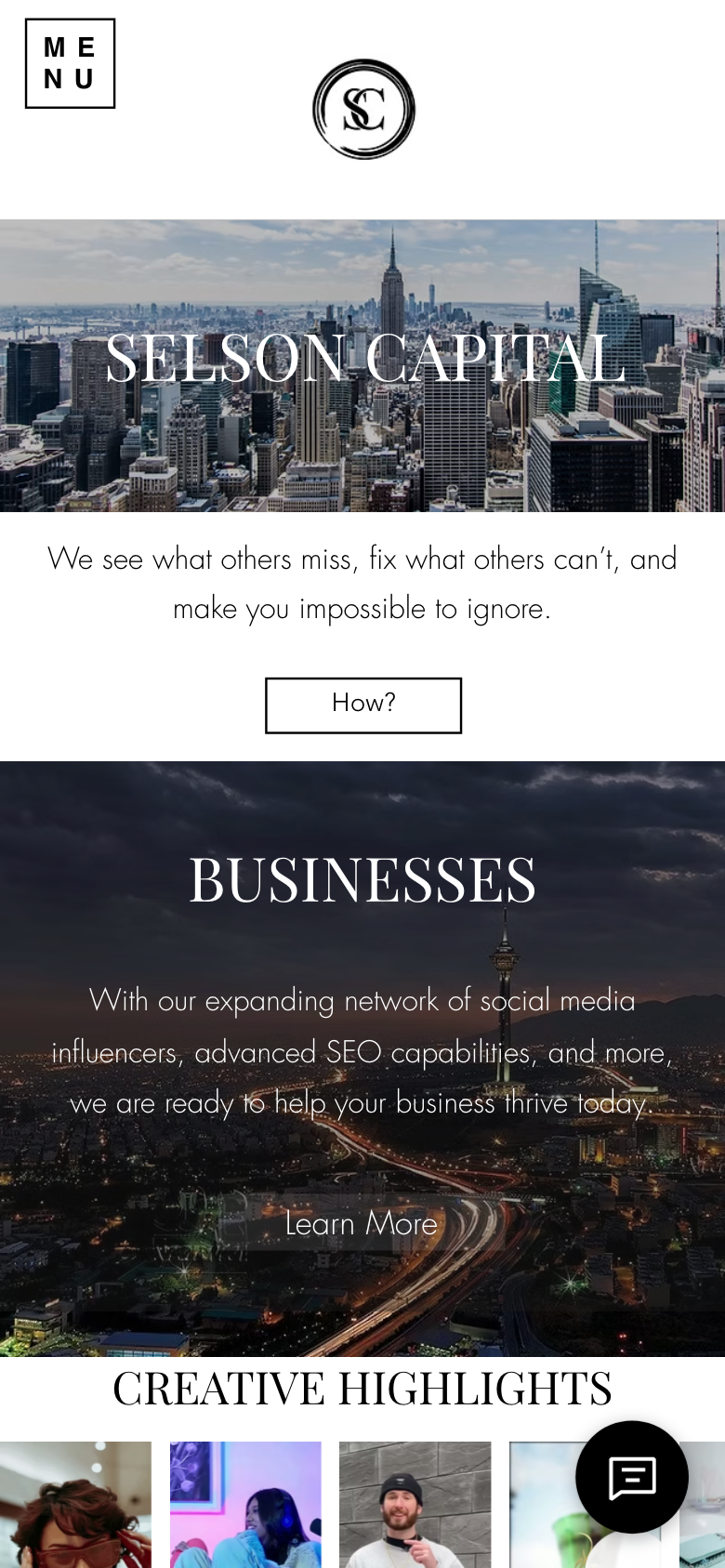
Selson Capital homepage viewed on a phone-sized screen, showing the MENU button, the logo, the hero image and the Businesses section
selsoncapital.com on a phone-sized screen, captured August 24, 2026.
Fits the screen properly, with a viewport tag set correctly and no sideways scrolling
Comfortable type sizes and a MENU button that is easy to hit
1
The same pale "Learn More" button is even harder to read over a photograph at phone size
2
The chat bubble sits over the gallery, covering part of the first row of work
Working

The responsive work is done properly

Sections that feel sparse on a wide desktop screen read well on a phone, where the photography fills the frame and the type has room. Over half of an agency's site visits arrive this way, and this is the version they see.

Gap

The chat widget overlaps content

The chat bubble sits over the bottom-right of the Creative Highlights gallery, covering part of the work it is meant to sit alongside. Moving it up slightly, or hiding it until the visitor scrolls, is a settings change.

Why this matters for your clients

Most people will meet this brand for the first time on a phone. It is worth knowing that the phone version is the better one, because it means the desktop layout is what needs attention rather than the responsive build.

The first content appears in well under half a second, which is genuinely quick and is what a visitor perceives as speed. Behind that, the page pulls 7.6MB across 265 requests before it finishes.

66/100
Opportunity
0.37sFirst content appears
2.9sFully loaded
1.28MBJavaScript the page loads
7.6MBTotal page weight
Working

The perceived speed is good

First contentful paint at 372 milliseconds and the DOM ready at 572 milliseconds mean a visitor sees the page almost immediately. That is the number that affects bounce rate most, and it is a strong one.

Gap

1.28MB of JavaScript, most of it not yours

The heaviest single file is the Wix gallery viewer at 204KB, followed by the platform's own runtime and 230KB across two chat-widget bundles. This is the cost of the platform rather than anything on your pages, and it is the ceiling you are working against.

Gap

1.1MB of images on one page

The homepage loads roughly 1.1MB of imagery, with the largest single photograph at 294KB. The photography is a real asset here, so this is about serving it at the right size rather than using less of it.

Why this matters for your clients

Speed matters twice: visitors leave slow pages, and Google uses page experience as a ranking input. Your start is fast. The weight behind it is largely the platform's, which is worth knowing before deciding whether the platform is the right long-term home for this brand.

If you do three things

The highest-impact fixes first

You don't have to tackle everything at once. Ranked by impact for effort, here's where to start.

1

Put the 13 unlinked pages into the navigation

Your service detail pages, your Team page and its six bios, and your Pricing page are all written, live, and invisible. Adding them to the navigation and linking them from the Services and About pages is an afternoon of work that improves search visibility, content depth, credibility, and conversion at the same time. Nothing else on this list returns as much for as little.

Effort: minimal · Impact: high
2

Delete the duplicate Services page and build a real contact page

Remove or noindex /copy-of-exclusive-services so the two pages stop competing for the same search, and give the site a proper contact page with a form and a phone number instead of an anchor to a block on the homepage. Both are small, both close problems that are costing you enquiries now.

Effort: minimal · Impact: high
3

Publish your proof, and mark up who you are

Attach client names and results to the Creative Highlights gallery, turn two or three of them into real case studies, and add Organization and LocalBusiness structured data with your address, hours, and services. The first closes the credibility gap a buyer feels; the second puts you into the AI answers your buyers are increasingly starting from.

Effort: moderate · Impact: high and growing

Want to talk through the findings?

This report walks through all nine areas of Selson Capital's website, with the highest-impact fixes listed first. The short version: the design is already good, and the site is being held back by structure rather than by taste. Thirteen pages you have already written and paid for are not reachable, and most of the score above moves the moment they are. If you would like to talk through any of it, or want the fixes handled, I am happy to walk you through what I would do first.

Prepared by Mark Moran · Akamai Media LLC · akamai.media